TeamBuilder Site has gone live

Collapse
X
 
  • Time
  • Show
Clear All
new posts
  • NAHSTE
    Probably owns the site
    • Feb 2009
    • 22233

    #91
    Originally posted by bnckeye27
    I have two completely made up CAS. The first is the one I'm less proud of, but happy with (all original logos; I'm not the best with my image creation skills, but these are okay):
    *away and alternates to come

    Avengers.


    Here are the logos for the Bears. Standing bears are completely originals and supposed to look like throwbacks. Graphic bear is a recolor of a missouri school for my helmet.


    Liking the color scheme and the stripes for the top one. Not really liking the colors on the 2nd one.

    Comment

    • NAHSTE
      Probably owns the site
      • Feb 2009
      • 22233

      #92
      Been going nuts with this the past few days. Here are a few of my favorite creations:

      The Georgia Northern University Komodo Dragons:

      Away


      Home


      St. John's (NY) Red Storm
      Away


      Home


      Xavier University Musketeers

      Away

      Home
      Last edited by NAHSTE; 06-29-2009, 09:09 PM.

      Comment

      • adembroski
        All-Inclusive!
        • Feb 2009
        • 1815

        #93
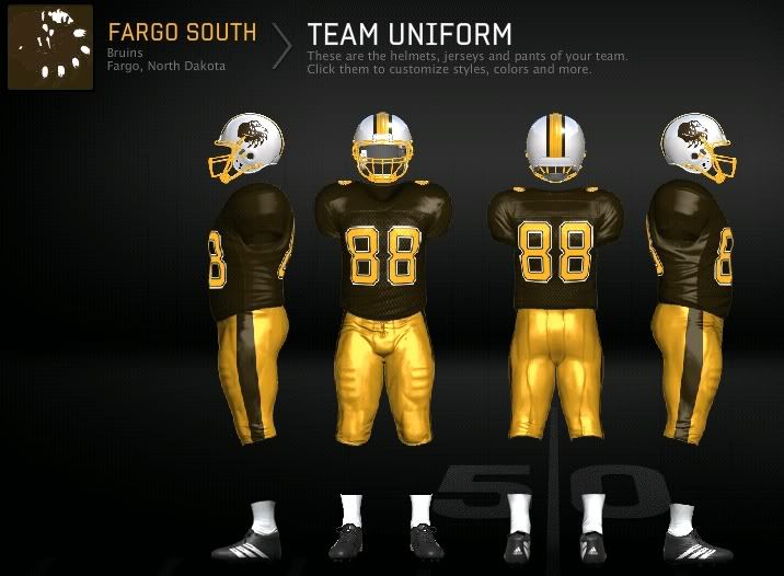
        Ran into a dude on OS who lives in Bismarck, so we decided to work on the High Schools here in North Dakota (I'm gonna try to hit a few Western Minnesota teams as well).

        Here's the first of that project.

        S.P.Q.A.

        Comment

        • βїģĐмợ
          Quack Quack
          • May 2009
          • 2630

          #94
          Originally posted by adembroski
          Ran into a dude on OS who lives in Bismarck, so we decided to work on the High Schools here in North Dakota (I'm gonna try to hit a few Western Minnesota teams as well).

          Here's the first of that project.
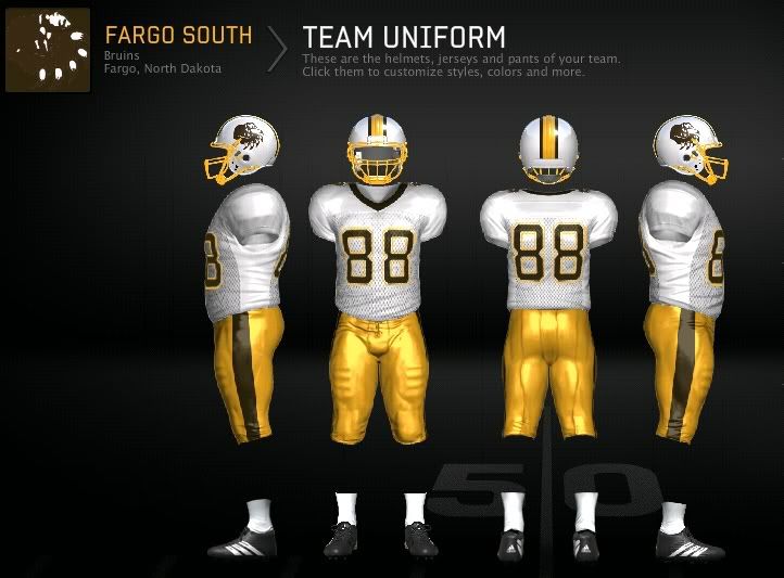

          IMO you should make it so that both helmet logos face the same way, unless the schools don't do that in real life

          PSN: BigDmo

          Comment

          • adembroski
            All-Inclusive!
            • Feb 2009
            • 1815

            #95
            Originally posted by BigDmo
            IMO you should make it so that both helmet logos face the same way, unless the schools don't do that in real life
            You're right, I wasn't thinking:P Thanks for pointing that out.
            S.P.Q.A.

            Comment

            • βїģĐмợ
              Quack Quack
              • May 2009
              • 2630

              #96
              Originally posted by adembroski
              You're right, I wasn't thinking:P Thanks for pointing that out.
              haha, for some reason it seems to be the first thing I'll notice about a helmet

              PSN: BigDmo

              Comment

              Working...