WVU among ten schools to get new Nike Pro Combat Uni's
Collapse
X
-
-
-
Comment
-
-
-
yeah, but maybe they should have gone with a bizarre/unique orange shade for the jersey?Originally posted by JayRockI :heart: Boise State's. The big Bronco looks so clean on the helmetComment
-
-
Why does it take so frikkin' long on that website????? Its not like I'm trying to break into the Pentagon's database.
Miami = hideous. Last year's version managed to somehow be boring & gaudy @ the same time. These just stick to gaudy.
VT's overdid it w/the design's w/in the numbers. But its the first time the Hokies jersey's won't cause epileptic seizures. Helmet is wicked, but I would change the stripes. Change the color to orange & let middle be maroon.
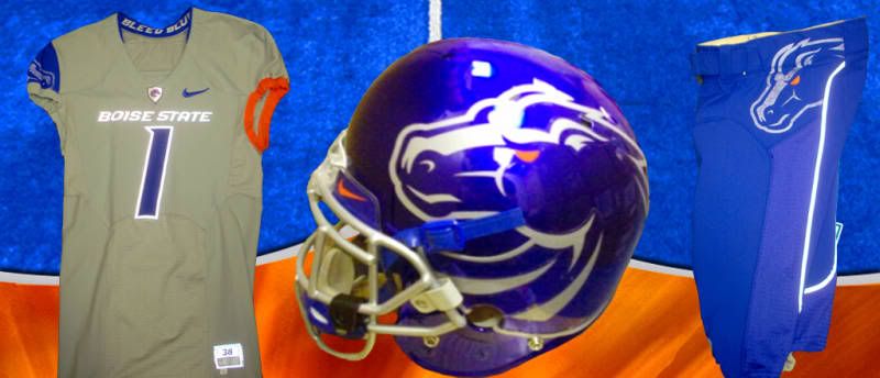
Boise St's problem is the logo. Its too big on the helmet. & either have both shoulders or hips w/the horse. Putting one on either side makes it look incomplete & bulky.
Ohio State's number design is pretty good. Otherwise, it looks inspired by a 3rd grader's art project. Nothing innovative, nothing to make you take notice.
West Virginia - The logo & uniform don't match. This one had sooooo much potential. The design is crisp. The coloring is sleek. The purple & gold letters just don't fit. I don't know. Maybe reversing the colors on the WV would work.
The horned frog armor was used too much. On the shoulder number should have been sufficient. The "bloodlines" on the helmet looks completely out of place. Either wear red or just forget about it completely. Also, I would have liked to have seen the "TCU" outlined on the helmet. It's hard for the helmet to look bold when the letters are looking so drab.
Take the gator skin off the helmet & Florida's are terrific. They look fresh, new, w/out being overly aggressive or busy. Shoulder design is excellent & the stripe on the pants do it justice. Good job.
Oregon State almost had it. I just don't like helmets w/o some kind of emblem on it. Give me a block orange "O" w/a thin white outline. And outline the numbers as well. You'd have perfect jersey. Love the pants. Love the helmet stripe. You just stopped a little too short.
Here's what you don't do when tweaking Bama's uni's....SCREW W/THE HELMET. The houndstooth pattern is ugly. Plain & simple. The new pants are nice.
Pitt has the best overall. No flaws. The "PITT" on the helmet is modern, yet no-nonsense. Number design is innovative. Pants stripe makes the players look strapped in for battle. Excellent work. It'll be hard for the Panthers not to be the best dressed team on the field w/these on.Comment
-
-
I know that. This isn't about tradition. This is about how they look. And WV's uniforms look like they were borrowed from someone else. Not that they were designed for the Mtneers. They should have come up w/something that would fit the logo or changed the logo. And even then, I don't know if I would have liked those uni's. The whole uniform is black & white & they plaster a purple & gold emblem on them. Looks sloppy, rushed & not thoroughly thought out.Comment
-
its supposed to be simple. its an homage to the 1940s team . I bet it was more ohio states idea in the first place. They probably told Nike- " dont give us the overdone crap like VT".Comment


Comment