College Football Unis

Collapse
X
 
  • Time
  • Show
Clear All
new posts
  • manchild24
    Kyle got fired
    • Nov 2008
    • 5863

    College Football Unis

    I know someone posted before the new look of Michigan and ND for some games but here is a link to an article on ESPN that has all the changes the teams made this season.

    LOVE Oregans
    Check Louisville out - I think those guys are in the band or the kickers or something.

  • NAHSTE
    Probably owns the site
    • Feb 2009
    • 22233

    #2
    Penn State making changes? What is the world coming to? Such a drastic move too, I can't believe this.

    Comment

    • G-men
      Posts too much
      • Nov 2011
      • 7579

      #3
      Of course the Rutgers one is a dead link...

      I do hope they wear the all blacks again though.

      Comment

      • bluntside
        Member
        • Jun 2009
        • 572

        #4
        I'm not really a big uniform guy, but this might be the ugliest "uniform" I have ever seen.
         

        Comment

        • Senser81
          VSN Poster of the Year
          • Feb 2009
          • 12804

          #5
          Originally posted by bluntside
          I'm not really a big uniform guy, but this might be the ugliest "uniform" I have ever seen.


          Comment

          • Warner2BruceTD
            2011 Poster Of The Year
            • Mar 2009
            • 26142

            #6
            Uniforms have never been uglier. This decades football unis are quickly surpassing 1970's professional basketball in that regard. I blame Nike.

            Comment

            • shag773
              Senior Member
              • Jul 2009
              • 2721

              #7
              Originally posted by NAHSTE
              Penn State making changes? What is the world coming to? Such a drastic move too, I can't believe this.

              Had the same reaction, but all they did was remove the while strips from the collars and sleeves, so essentially they are going back to a more traditional look.

              I was listening to Jason and the GM this morning (by complete accident, although it wasn't horrible) and I heard the new Maryland uni's are atrocious..

              **Edit** Just clicked on the link, they are...

              Comment

              • Swarley
                A Special Kind of Cat
                • Jul 2010
                • 11213

                #8
                My favorites that are new this season are Arizona States and Oklahoma States.

                Comment

                • Villain
                  [REDACTED]
                  • May 2011
                  • 7768

                  #9
                  I like the shamrock ND will have on the golden domes for the game against Michigan.
                  [REDACTED]

                  Comment

                  • Nash
                    How Bout Them Dawgs
                    • Feb 2009
                    • 3531

                    #10
                    outside the helmet, penn state and Georgia Southern have the same uniforms now

                    Comment

                    • G-men
                      Posts too much
                      • Nov 2011
                      • 7579

                      #11
                      Originally posted by shag773
                      I was listening to Jason and the GM this morning (by complete accident, although it wasn't horrible) and I heard the new Maryland uni's are atrocious..

                      **Edit** Just clicked on the link, they are...
                      That's exactly what I thought about the Maryland uni's. They showed the old ones and the new ones in that picture and the old ones were way better.

                      Comment

                      • DoubleDeuce
                        Spellin' n' shit
                        • Feb 2009
                        • 5873

                        #12
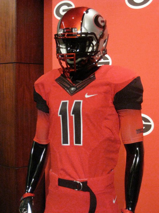
                        UGA's unis are ugly, but I'm definitely loving that facemask.

                        Comment

                        • Deviant
                          Yes, please.
                          • Nov 2008
                          • 2861

                          #13
                          Nike really has put their stamp on college football (adidasandunderarmourbitingsoooohard), but here are my thoughts.

                          I actually like some of the Nike uniforms. I think that part of college football is pride in school and pageantry. The uniforms probably speak that the most, so I don't really mind what Nike is doing. That said:

                          - Oklahoma State's uniforms finally look as if all the pieces go together and I really love the look. It's 2010 style, but not insulting to the school. It's a Pro Combat look, but it's actually kinda nice. It's no Michigan State (I think Michigan State's look is going to state for a decade or so; Nike hit it on the head with MSU), but I like it.

                          - Speaking of MSU, look who's recycling designs? Sorry TCU, doesn't work for you. Stick to whatever you wore for the Rose Bowl.

                          - Houston's throwback uniforms should become their every game uni. I usually HATE faux-throwbacks (i.e. Sixers, Lightning, Warriors), but this one works. Mainly because there's no silly piping and it feels retro, yet has a modern polish. If they get rid of the number outline, I think that uniform if perfect.

                          - New Baylor stripes are awful. I hope that sees the end of tunnel quickly.

                          - Marshall's insignia is lulzworthy. Really? Street-style lettering? Weak.

                          - ASU, I'm torn on. I mean, thank the lord they got away from raping their 90's-early 00's uniforms with all the silly piping and just went with some new (and the designs for it look frickin' awesome, I actually love the designs because they feel and look energized and the uniforms were in desperate need for a fresh breath of air). But, for some reason, the actual uniform doesn't "pop" like the design does.

                          - The more I see Colorado's uniform, the more I wish they would just go back to this uniform.

                          - Maryland (finally, not Nike!), is bizarre. I mean, I look at the pieces individually, and they're laughable. But, honestly, I think some of them, whe assembled, actually look already. It's really flamboyant and reeks of trying to be Oregon, but some of them look alright to me. For instance, the black jersey/yellow pants combo is actually nice. The yellow jersey/white pants combo is AWFUL. But I gotta' give Maryland a break. When you're school colors are black, red, and yellow, you're going to be hit or miss.

                          - I'm going to miss the solid big stripe for Penn State. Now, their jerseys remind me of Virginia. BTW, Virginia's current uniforms should never be touched. They are perfect.

                          - Utah went back to standard numbers. Excellent choice and the uniforms look a bit more cleaned up. Really nice and clean modern look.

                          - Washington State has nice uniforms (although they're guilty of biting Michigan State too), but man, they need to keep the fuck away from gray and silver uniforms. Those are atrocious. I'll wear anything Maryland before I have to put on those.

                          - I like what Kentucky is doing with their uniform, but the execution is off. The checkboard feels right for the home uniform, but feels forced for the away.

                          - Love the players on South Carolina, but I'm gonna' hate watching them in those hideous uniforms. Looks like someone half-assed their entire uniform and found the blandest looking text and type it in using Microsoft Word. The design is so fucking awful. It looks so D-3 looking. But, I will say, those ankle brace cleats are kinda' tight.

                          - Florida International looks like they can be taken seriously. Much cleaner, no crazy designs, just nice and simple. Like UniWatch said, addition by subtraction.

                          - Georgia Tech's uniforms look feminine. That is all.


                          Back at it, yet again. Sign up here!

                          Comment

                          • Sportsbuck
                            Buckeye For Life
                            • Dec 2008
                            • 3045

                            #14
                            Nike > Under Armour > Adidas

                            Comment

                            • Deviant
                              Yes, please.
                              • Nov 2008
                              • 2861

                              #15
                              Bonus: Is it just me, or does Buffalo's uniform just look like the Orlando Magic?


                              Back at it, yet again. Sign up here!

                              Comment

                              Working...