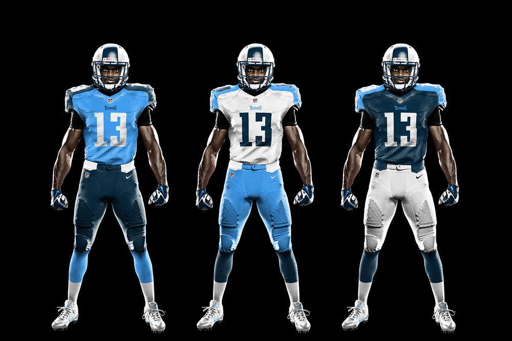
All 32 teams uniforms re-designed

Collapse
X
 
  • Time
  • Show
Clear All
new posts
  • Hasselbeck
    Jus' bout dat action boss
    • Feb 2009
    • 6175

    All 32 teams uniforms re-designed

    Not sure who this Jesse Alkire guy is, but the Bucs should have hired him.. basically this guy re-designed every teams look.. some of them just got modest modifications, while others got entire new looks.. and a lot of them are incredible.


    My favorite is probably the Ravens modification..


    Originally posted by ram29jackson
    I already said months ago that Seattle wasn't winning any SB
  • Maynard
    stupid ass titles
    • Feb 2009
    • 17876

    #2
    those look terrible

    Comment

    • Aso
      The Serious House
      • Nov 2008
      • 11137

      #3
      I like these a lot. I wouldn't mind these being every teams uniforms.

      Comment

      • Hasselbeck
        Jus' bout dat action boss
        • Feb 2009
        • 6175

        #4
        Originally posted by Maynard
        those look terrible
        Well this validates that this guys work is excellent.
        Originally posted by ram29jackson
        I already said months ago that Seattle wasn't winning any SB

        Comment

        • ram29jackson
          Noob
          • Nov 2008
          • 0

          #5
          flat and bland beginner junk. Everyone thinks they are a designer with what ever computer tools they use.

          his single stripes over helmets with no trim is abused too much and again is very bland. He makes every team look the same without working on each teams individual identity

          this was a rush job

          Comment

          • Woy
            RIP West
            • Dec 2008
            • 16372

            #6
            Figures that they think the Titans' uni is good enough.


            ^ Shouts to MvP for the sick sig. GFX TEAM BACK

            .

            Comment

            • ram29jackson
              Noob
              • Nov 2008
              • 0

              #7
              Originally posted by Woy
              Figures that they think the Titans' uni is good enough.
              I like the Titans real uni but he dumbed it down poorly


              Comment

              • Bomberooski
                #GoHawks
                • Feb 2009
                • 10474

                #8
                I did like this Royals hat on his site:

                I give rep not thanks
                My Audio Blog (Whoring)

                Comment

                • spursup
                  Noob
                  • Dec 2013
                  • 505

                  #9
                  Some of these are exactly the same as the real life unis. That said I don't have a problem with any of these.

                  Comment

                  • NAHSTE
                    Probably owns the site
                    • Feb 2009
                    • 22233

                    #10
                    Originally posted by ram29jackson
                    flat and bland beginner junk. Everyone thinks they are a designer with what ever computer tools they use.
                    Says the guy who uses the TeamBuilder templates which haven't been touched in 5 years.

                    Comment

                    • Hasselbeck
                      Jus' bout dat action boss
                      • Feb 2009
                      • 6175

                      #11
                      Originally posted by ram29jackson
                      flat and bland beginner junk. Everyone thinks they are a designer with what ever computer tools they use.

                      his single stripes over helmets with no trim is abused too much and again is very bland. He makes every team look the same without working on each teams individual identity

                      this was a rush job

                      I think those Bills unis are awesome.

                      Originally posted by ram29jackson
                      I already said months ago that Seattle wasn't winning any SB

                      Comment

                      • ram29jackson
                        Noob
                        • Nov 2008
                        • 0

                        #12
                        Originally posted by Hasselbeck
                        I think those Bills unis are awesome.

                        says the guy who thinks lime green is a manly color

                        Comment

                        • Glenbino
                          Jelly and Ice Cream
                          • Nov 2009
                          • 4994

                          #13
                          I dunno.. I like the diversity of the unis now.. if anything I wish a lot of teams would go back to their old unis full time.

                          Sent from my HTC6500LVW using Tapatalk

                          Comment

                          • ram29jackson
                            Noob
                            • Nov 2008
                            • 0

                            #14
                            Originally posted by NAHSTE
                            Says the guy who uses the TeamBuilder templates which haven't been touched in 5 years.

                            and yet can still a better job than his stuff.

                            I never said my stuff is comparable to professionals but in the ncaa teambuilder world I'm the best to ever use it.

                            Comment

                            • NAHSTE
                              Probably owns the site
                              • Feb 2009
                              • 22233

                              #15
                              Originally posted by ram29jackson
                              and yet can still a better job than his stuff.

                              I never said my stuff is comparable to professionals but in the ncaa teambuilder world I'm the best to ever use it.
                              So someone who used (from what it would appear) Adobe Illustrator and executed a clean and professional looking presentation is an amateur who merely thinks he's a designer, but using EA's stock templates from 2008 and the same four typefaces over and over again makes you one?


                              Go Glam Punks.
                              Last edited by NAHSTE; 03-05-2014, 08:31 PM.

                              Comment

                              Working...