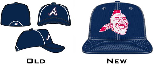
I've never been one to be politically correct, and honestly don't see what the problem is here. But apparently people are offended by this. Discuss.
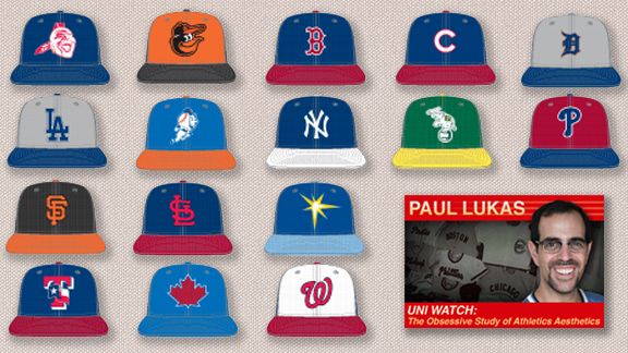
I'm just pissed the Brewers picked such an ugly design. With other teams starting a trend of putting oldschool mascots on the BP cap, I don't understand why the Brewers and Padres didn't follow suit. The barrel man and the friar are both great logos.


Comment